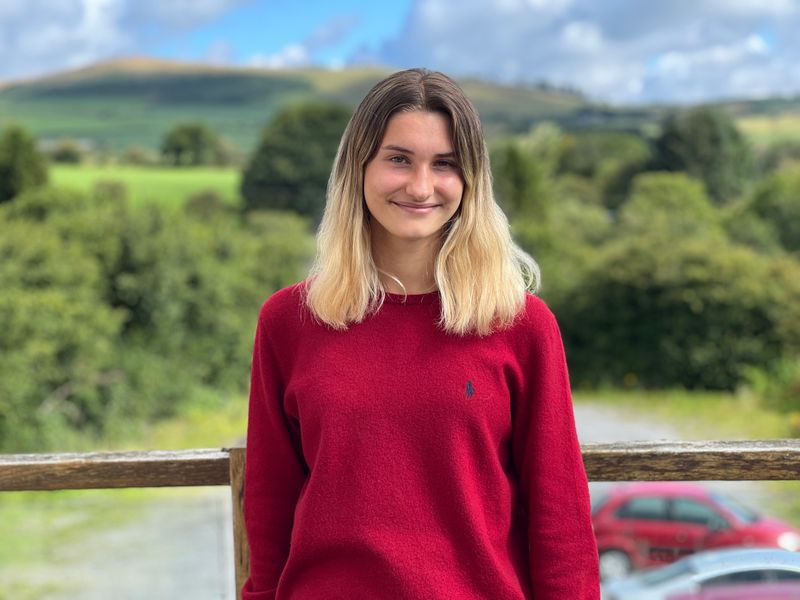
Hi, I'm Amber, the Editorial Assistant at CraftCourses. Photography, to me, is a realm of playful exploration where I can experiment with diverse ideas, pushing beyond the conventional to infuse my images with meaning. This blog introduces the body of work I created during my time in sixth form, offering a glimpse into my photography journey.
The process of outgrowing cherished toys
During my A Level Photography project, I delved into the concept of "forgotten things," a theme that allowed for various interpretation. This intriguing concept led me to explore the passage of time, memories, and the diverse stages of life.
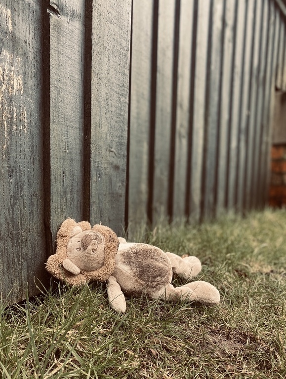
The initial phase of my exploration focused on childhood, where I revisited cherished remnants that encapsulated the essence of innocence and joy. One of my favourite images from this phase is an image I took of a shabby teddy bear, symbolising the transition from carefree days to the complexities of early adulthood.
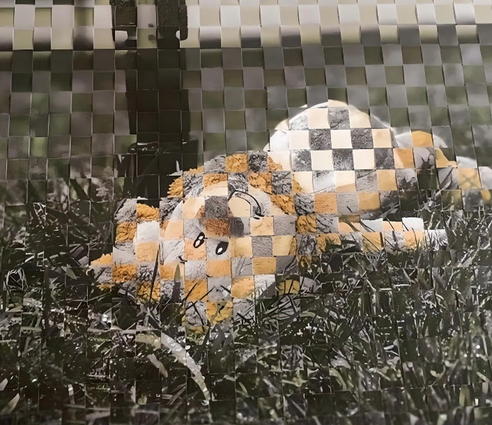
In the image below, I used the technique of paper weaving to convey the nuances of remembering and forgetting, evoking nostalgia and a sense of time slipping away:
Paper weaving 2 images: One in black and white and the other in colour
The colourful bursts in the image represent vibrant tributes to the past, filled with memories. The prime condition of the teddy bear serves as a heartfelt acknowledgment of the care intricately woven into those cherished moments. Conversely, the black and white tones evoke feelings of melancholy and abandonment. This greyscale version, depicting the teddy marred by dirt, creates a powerful visual, illustrating the stark contrast between remembrance and oblivion.
For my second stage of life, I explored the complexities of teenage life. This exploration emphasised the tendency to overlook and leave behind long-standings friendships as we navigate the journey of growing up, contributing to the broader narrative of forgotten experiences and relationships.
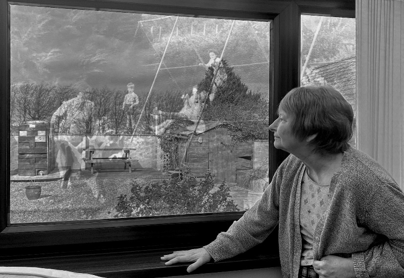
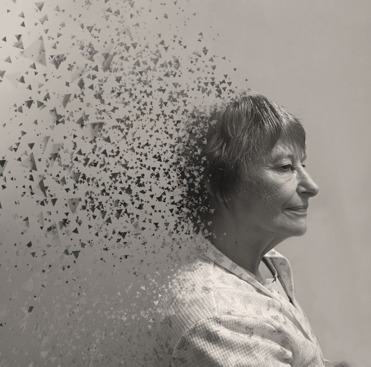
During my final stage of life I explored late adulthood, focusing on the destructive consequences of dementia on memory:
My grandma peering out the window at a fading memory, capturing the ache of losing cherished memories from her childhood.
To encapsulate the profound impact of dementia, I deliberately chose the medium of black and white photography. The absence of colour intensifies emotional resonance, particularly in conveying the sadness associated with fading recollections. The timeless quality of black and white also evokes nostalgia, effectively capturing the essence of old times.
Another concept I toyed with was to create the impression that the mind is disintegrating, serving as a metaphor for dementia's negative effects and the way it destructs the mind:
The negative consequences of dementia on the mind
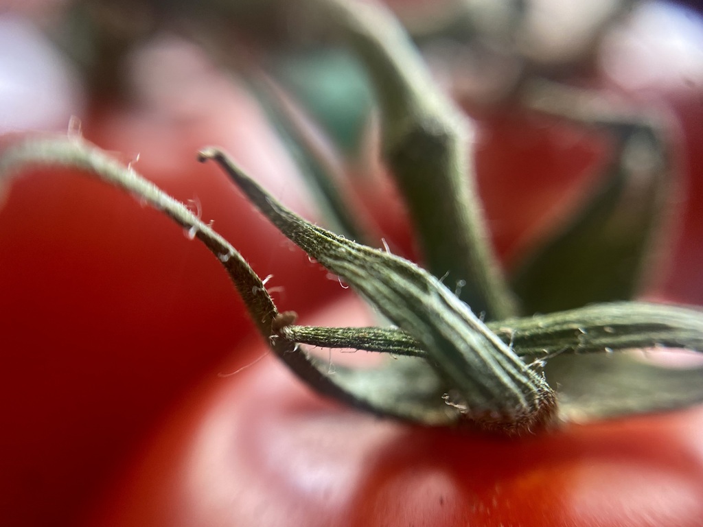
In addition to exploring "forgotten things," I delved into the realm of colour, focusing on complementary colours, selective colour, and the captivating contrasts in black and white photography. This exploration added new dimensions to my work, resulting in vibrant compositions that uniquely capture the essence of my subjects.
While I experimented with colour combinations on Photoshop, I also sought naturally occurring complementary pairs. The vibrant and visually striking contrast between red and green caught my attention, prompting me to capture their unique interplay.
Macro photography: Seeing small details close up
This piece, captured using a macro lens—an unfamiliar tool to me at the time—revealed a newfound fascination with macro photography. By attaching the lens to my phone camera, I aimed to expose the subtle details and textures which are often unnoticed in conventional photography, providing a distinctive perspective.
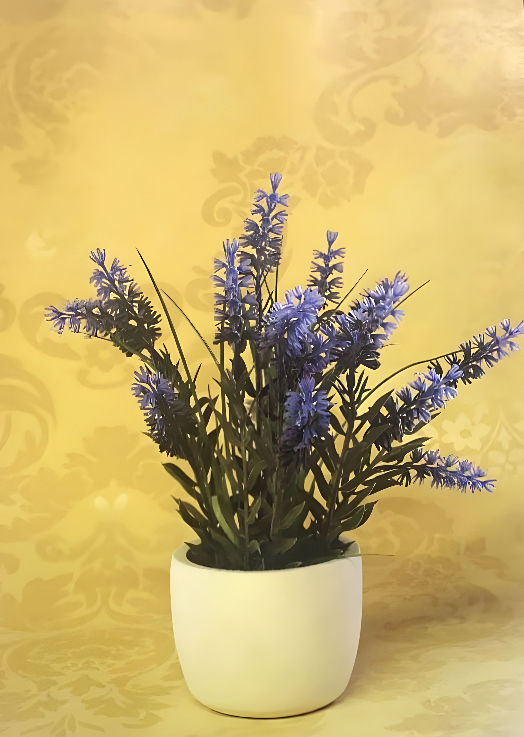
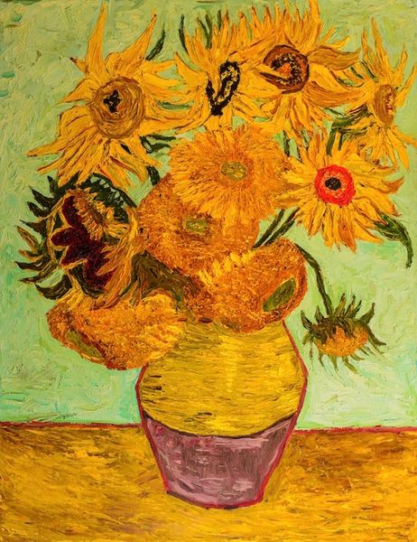
Whilst investigating the significance of complementary colours, I drew inspiration from Vincent Van Gogh, renowned for effectively using contrasting colours to add depth and energy to his paintings. In an attempt to mimic his artworks, I deliberately highlighted the interplay of purple and yellow, just like he did in his painting of the irises.
Inspired by Van Gogh's image of the irises, using complementary colours
Van Gogh tactically used purple for mystery and introspection, representing his fascination with the mystical and his emotional struggles, while lively yellow symbolises joy and energy. The dynamic interplay of these colours highlights Van Gogh's ability to convey profound emotions beyond a simple floral depiction.
Upon completing sixth form last year, I have joined CraftCourses as an Editorial Assistant. Fortunately, I’ve been given the opportunity to contribute to the website’s visual appeal by photographing our gift vouchers. My former school, Ysgol Bro Preseli, generously allowed me to use their photography equipment to photograph these gift vouchers.
Celebration gift card - perfect for birthdays!
Our gift vouchers and cards make memorable and flexible creative experience gifts. They can be printed, placed in a beautiful personalised greeting card, are hand stamped and posted First Class. They come in a range of artistic designs. Have a look yourself!
If you're inspired to explore the captivating world of photography, we have several courses available that can help you hone your skills. Check out our diverse selection of photography courses here. From portrait photography and wildlife photography to still life photography, there's plenty to choose from—perfect for beginners starting out on their creative journeys!
Our website uses cookies to give you the best user experience. By using the site you are consenting to our use of cookies. You can find out more in our Privacy Policy.
You can manage your selection from the 'Cookie settings' in the footer of the page